← BackPython | Data Visualization | Web Design | Solo work
I built this dashboard using Python's Plotly and Dash libraries, resulting in a highly interactive web interface that utilizes cross-filtering, dropdown menus and radio buttons to visualize relevant data.
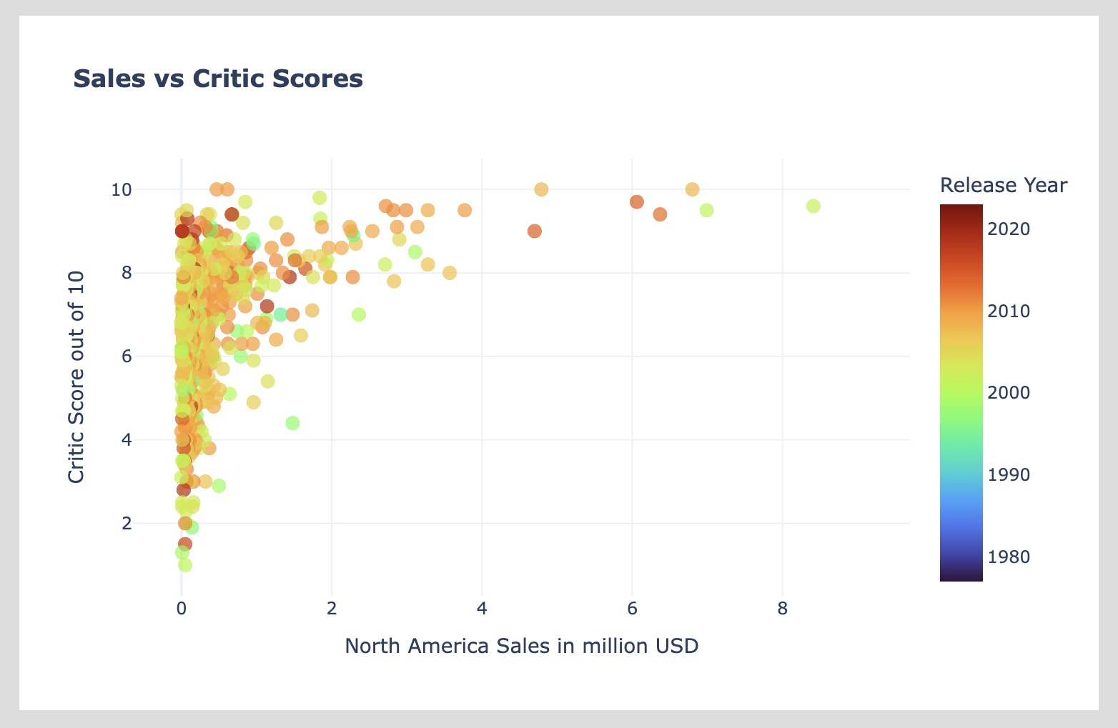
The dataset I used provides sales information for thousands of video game titles that have been released in the last 50 years, including the sales for different regions of the world and overall critical reception of each game.

It took more than just importing the data into a .py to make this happen. I began by exploring the dataset using the Pandas Python library. I built dozens of graphs along the way. With each one, I not only understood the data better, I also refined my visual approach. Colors, markers, and tooltips have all been carefully selected to provide users with clear, accurate, and helpful information.
The intention of this project was to demonstrate how the sales of different genres fared across the regions of the world. As an added bonus, you can select individual games from the scatterplot to see more information, such as how sales are distributed across different consoles.